The following guide explains the ReactiveChart usage with pie chart.
Usage
Basic Usage
<ReactiveChart
// pre-built chart type
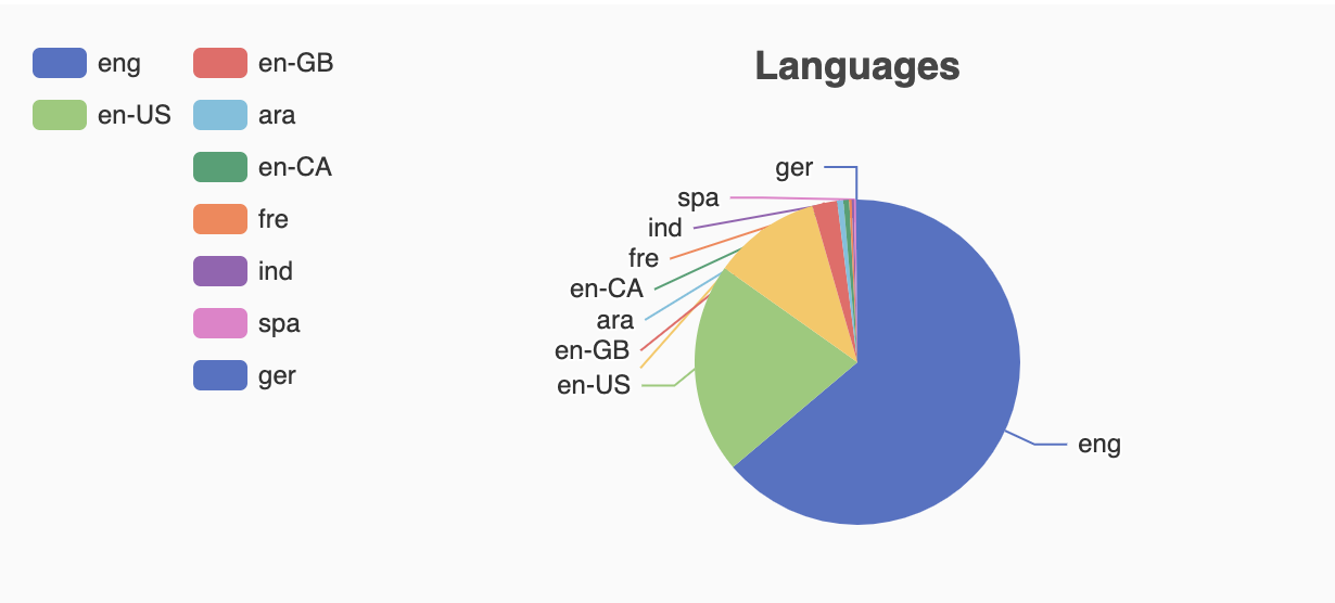
chartType="pie"
// unique id for component
componentId="language"
// Database field to connect
dataField="language_code.keyword"
// Chart title
title="Languages"
/>Usage With All Props
    <ReactiveChart
        componentId="Language"
        dataField="language_code.keyword"
        chartType="pie"
        title="Languages"
        size={100}
        index="good-books-ds"
        sortBy="count"
        react={{
            and: ['SearchFilter'],
        }}
        useAsFilter={true}
        showFilter={true}
        filterLabel="Language"
        URLParams
        loader="Loading ..."
        renderError={error => <div>Something went wrong! {error}</div>}
        // event callbacks
        onClick={(item) => {}}
        onDblClick={(item) => {}}
        onMouseDown={(item) => {}}
        onMouseUp={(item) => {}}
        onMouseMove={(item) => {}}
        onMouseOut={(item) => {}}
        onGlobalOut={(item) => {}}
        onContextMenu={(item) => {}}
        onError={(error) => {}}
    />
Props
-
componentId
Stringunique identifier of the component, can be referenced in other components'
reactprop. -
dataField
Stringdata field to be connected to the component's UI view. The chart data is filtered by a database query on this field. This field is used for doing an aggregation and returns the result.
-
chartType
StringPre-built chart types supported by
ReactiveChart. Valid options are:pie,line,bar,histogramandchart. -
nestedField
String[optional]use to set the
nestedmapping field that allows arrays of objects to be indexed in a way that they can be queried independently of each other. Applicable only when dataField is a part ofnestedtype. -
title
String or JSX[optional]title of the component to be shown in the UI.
-
loader
String or JSX[optional]to display an optional loader while fetching the options.
-
size
Number[optional] number of items to be displayed.Note:
- Appbase users should use the
aggregationSizeprop instead. Thesizeprop would only set the size forhitsnot theaggregations. - We recommend Appbase users to not use the
sizeprop unless they are usinghitsbecause it can impact the query performance.
- Appbase users should use the
-
aggregationSize To set the number of buckets to be returned by aggregations.
Note: This prop is only applicable when
enableAppbaseis set totrue. -
sortBy
String[optional]sort the items by one of
count,asc,desc. Defaults tocount, which sorts the by the frequency of count value, most first. -
showMissing
Boolean[optional]defaults to
false. When set totrueit also retrives the aggregations for missing fields under the label specified bymissingLabel. -
missingLabel
String[optional]defaults to
N/A. Specify a custom label to show whenshowMissingis set totrue. -
showFilter
Boolean[optional]show as filter when a value is selected in a global selected filters view. Defaults to
true. -
filterLabel
String[optional]An optional label to display for the component in the global selected filters view. This is only applicable if
showFilteris enabled. Default value used here iscomponentId. -
URLParams
Boolean[optional]enable creating a URL query string parameter based on the selected value of the chart. This is useful for sharing URLs with the component state. Defaults to
false. -
renderError
String or JSX or Function[optional] can be used to render an error message in case of any error.renderError={(error) => ( <div> Something went wrong!<br/>Error details<br/>{error} </div> ) } -
value
string[optional] controls the current value of the component. It selects the item from the chart UI (on mount and on update). Use this prop in conjunction withonChangefunction. -
onChange
function[optional] is a callback function which accepts component's current value as a parameter. It is called when you are using thevalueprops and the component's value changes. This prop is used to implement the controlled component behavior. -
onError
Function[optional] gets triggered in case of an error and provides theerrorobject, which can be used for debugging or giving feedback to the user if needed. -
index
String[optional] The index prop can be used to explicitly specify an index to query against for this component. It is suitable for use-cases where you want to fetch results from more than one index in a single ReactiveSearch API request. The default value for the index is set to theappprop defined in the ReactiveBase component.Note: This only works when
enableAppbaseprop is set to true inReactiveBase. -
useAsFilter
Boolean[optional] If set tofalsethen data selection on chart UI would not filter the results. Defaults totrue.
Demo
Extending
ReactiveChart component can be extended to
- Customize the chart UI using
setOption, - update the underlying DB query with
customQuery,defaultQuery, - specify how options should be filtered or updated using
reactprop.
    <ReactiveChart
        // To customize the query to fetch chart data
        defaultQuery={(value, props) => ({
            "aggs": {
                "language_code": {
                    "terms": {
                        "field": "language_code"
                    }
                }
            }
        })}
         // To customize the query to filter results based on value selection
        customQuery={(value, props) => ({
            "query": {
                "term": {
                    [props.dataField]: value
                }
            }
        })}
        // Customize the chart UI, set custom echart option
        setOption={({ aggregationData }) => ({
            tooltip: {
                trigger: 'item',
            },
            legend: {
                orient: 'vertical',
                left: 'left',
            },
            series: [
                {
                    name: 'Access From',
                    type: 'pie',
                    radius: '50%',
                    data: aggregationData.map(item => ({
                        value: item.doc_count,
                        name: item.key,
                    })),
                    emphasis: {
                        itemStyle: {
                            shadowBlur: 10,
                            shadowOffsetX: 0,
                            shadowColor: 'rgba(0, 0, 0, 0.5)',
                        },
                    },
                },
            ],
        })}
        // specify how and which options are filtered using `react` prop.
        react={
            "and": ["pricingFilter", "dateFilter"],
            "or": ["searchFilter"]
        }
/>- customQuery
Functionis a callback function which accepts component's current value as a parameter and returns the data query to be applied to the component, as defined in Elasticsearch Query DSL.Note:customQuery is called on value changes in the ReactiveChart component as long as the component is a part ofreactdependency of at least one other component. - defaultQuery
Functiontakes value and props as parameters and returns the data query to be applied to the source component, as defined in Elasticsearch Query DSL, which doesn't get leaked to other components. Read more about it here. - setOption
FunctionReactiveChartuses the Echarts library to render the UI.ReactiveChartcomponent connects the search backend to retrieve the chart data. ThesetOptionprop allows you to define the custom chart option support by Echarts to render any kind of chart UI. It accepts the an object containing the following properties:aggregationDataAn array of aggregation bucketsdataAn array of search hitsrawDataSearch backend data in raw formvalueCurrent selected value in chart UI
setOption={({ data, aggregationData, rawData, value }) => ({ title: { text: "Languages" }, tooltip: { trigger: 'item', }, legend: { orient: 'vertical', left: 'left', }, series: [ { name: 'Access From', type: 'pie', radius: '50%', data: aggregationData.map(item => ({ value: item.doc_count, name: item.key, })), emphasis: { itemStyle: { shadowBlur: 10, shadowOffsetX: 0, shadowColor: 'rgba(0, 0, 0, 0.5)', }, }, }, ], })} - react
Objectspecify dependent components to reactively update ReactiveChart's options.- key
Stringone ofand,or,notdefines the combining clause.- and clause implies that the results will be filtered by matches from all of the associated component states.
- or clause implies that the results will be filtered by matches from at least one of the associated component states.
- not clause implies that the results will be filtered by an inverse match of the associated component states.
- value
String or Array or ObjectStringis used for specifying a single component by itscomponentId.Arrayis used for specifying multiple components by theircomponentId.Objectis used for nesting other key clauses.
- key


