MultiDropdownList creates a dropdown based multiple selection list UI component that is connected to a database field. It is used for filtering results based on the current selection from a list of items.
Note
This component is exactly like the MultiList component except the UI is based on a dropdown, ideal for showing additional UI filters while conserving screen space.
Example uses:
- create an e-commerce facet like search experience.
- create a filter for airlines to fly by in a flight booking experience.
Usage
Basic Usage
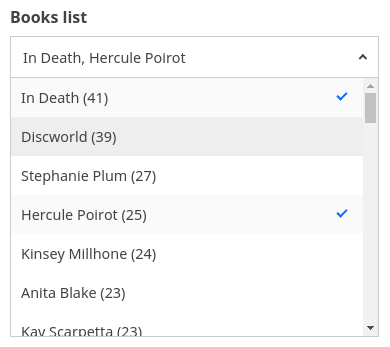
<MultiDropdownList componentId="CitySensor" dataField="group.group_city.raw" title="Cities" />Usage With All Props
<MultiDropdownList
    componentId="CitySensor"
    dataField="group.group_city.raw"
    title="Cities"
    size={100}
    sortBy="count"
    defaultValue={['London']}
    showCount={true}
    placeholder="Search City"
    react={{
    	and: ['CategoryFilter', 'SearchFilter'],
    }}
    showFilter={true}
    filterLabel="City"
    URLParams={false}
    loader="Loading ..."
    endpoint={{
      url:"https://appbase-demo-ansible-abxiydt-arc.searchbase.io/recipes-demo/_reactivesearch.v3", //mandatory
      headers:{
        // relevant headers
      },
      method: 'POST'
    }}
/>
Usage as a controlled component
function Index(props) {
	const [values, setValues] = useState([]);
	return (
		<MultiDropdownList
			componentId="BookSensor"
			dataField="original_series.raw"
			size={100}
			value={values}
			onChange={setValues}
		/>
	);
}
Props
-
componentId
Stringunique identifier of the component, can be referenced in other components'reactprop. -
endpoint
Object[optional] endpoint prop provides the ability to query a user-defined backend service for this component, overriding the data endpoint configured in the ReactiveBase component. Works only whenenableAppbaseistrue. Accepts the following properties:- url
String[Required] URL where the data cluster is hosted. - headers
Object[optional]
set custom headers to be sent with each server request as key/value pairs. - method
String[optional]
set method of the API request. - body
Object[optional]
request body of the API request. When body isn't set and method is POST, the request body is set based on the component's configured props.
- Overrides the endpoint property defined in ReactiveBase.
- If required, use
transformResponseprop to transform response in component-consumable format.
- url
-
dataField
StringDB data field to be mapped with the component's UI view. The dropdown list items are filtered by a database query on this field. This field is used for doing an aggregation and returns the result. We're using a.rawmultifield here. You can use a field of typekeywordornot_analyzeddepending on your Elasticsearch cluster. -
nestedField
String[optional] use to set thenestedmapping field that allows arrays of objects to be indexed in a way that they can be queried independently of each other. Applicable only when dataField is a part ofnestedtype. -
loader
String or JSX[optional] to display an optional loader while fetching the options. -
title
String or JSX[optional] title of the component to be shown in the UI. -
size
Number[optional] number of list items to be displayed.Note:
- Appbase users should use the
aggregationSizeprop instead. Thesizeprop would only set the size forhitsnot theaggregations. - We recommend Appbase users to not use the
sizeprop unless they are usinghitsbecause it can impact the query performance.
- Appbase users should use the
-
aggregationSize To set the number of buckets to be returned by aggregations.
Note: This prop is only applicable when
enableAppbaseis set totrue. -
sortBy
String[optional] property that decides on how to sort the list items, accepts one ofcount,ascordescas valid values.countsorts the list based on the count occurences, with highest value at the top.ascsorts the list in the ascending order of the list item (Alphabetical).descsorts the list in the descending order of the term. Defaults tocount.
-
defaultValue
String Array[optional] select one or more options from the dropdown list on mount. Accepts anArrayobject containing the items that should be selected. -
value
String Array[optional] controls the current value of the component. It selects the item from the list (on mount and on update). Use this prop in conjunction withonChangefunction. -
queryFormat
String[optional] queries the selected items from the list in one of two modes:or,and.- Defaults to
orwhich queries for results where any of the selected list items are present. - In
andmode, the applied query filters results where all of the selected items are present.
- Defaults to
-
showCount
Boolean[optional] show count of number of occurences besides an item. Defaults totrue. -
showSearch
Boolean[optional] whether to show a searchbox to filter the list items locally. Defaults tofalse. -
showClear
Boolean[optional] whether to show a clear button to clear the entered text in the searchbox. Defaults tofalse. -
transformData
Function[optional] allows transforming the data to render inside the list. You can change the order, remove, or add items, tranform their values with this method. It provides the data as param which is an array of objects of shape{ key: <string>, doc_count: <number> }and expects you to return the array of objects of same shape. -
showMissing
Boolean[optional] defaults tofalse. When set totrueit also retrives the aggregations for missing fields under the label specified bymissingLabel. -
missingLabel
String[optional] defaults toN/A. Specify a custom label to show whenshowMissingis set totrue. -
placeholder
String[optional] placeholder to be displayed in the select box. It'll be only applicable when no value is selected. -
searchPlaceholder
String[optional] placeholder to be displayed in the search box. Defaults toType here to search.... -
showFilter
Boolean[optional] show as filter when a value is selected in a global selected filters view. Defaults totrue. -
filterLabel
String[optional] An optional label to display for the component in the global selected filters view. This is only applicable ifshowFilteris enabled. Default value used here iscomponentId. -
URLParams
Boolean[optional] enable creating a URL query string parameter based on the selected value of the list. This is useful for sharing URLs with the component state. Defaults tofalse. -
showLoadMore
Boolean[optional] defaults tofalseand works only with elasticsearch >= 6 since it uses composite aggregations. This adds a "Load More" button to load the aggs on demand combined with thesizeprop. Composite aggregations are in beta and this is an experimental API which might change in a future release.Note:
Composite aggregations do not support sorting by
count. Hence withshowLoadMore, you can only sort by:ascordescorder.sortByprop defaults toascwhenshowLoadMoreprop is used. -
renderItem
Function[optional] customize the rendered list via a function which receives the item label, count & isSelected and expects a JSX or String back. For example:renderItem={(label, count, isSelected) => ( <div> {label} <span style={{ marginLeft: 5, color: isSelected ? 'red' : 'dodgerblue' }}> {count} </span> </div> )} -
render
Function[optional] an alternative callback function torenderItem, where user can define how to render the view based on all the data changes.
It accepts an object with these properties:loading:booleanindicates that the query is still in progresserror:objectAn object containing the error infodata:arrayAn array of results obtained from the applied query.rawDataobjectAn object of raw response as-is from elasticsearch query.value:arraycurrent selected values.handleChange:functionA callback function can be used to mark the list value as selected.downshiftProps:objectprovides all the control props fromdownshiftwhich can be used to bind list items with click/mouse events. Read more about it here.
<MultiDropdownList
	render={({ loading, error, data, handleChange }) => {
		if (loading) {
			return <div>Fetching Results.</div>;
		}
		if (error) {
			return <div>Something went wrong! Error details {JSON.stringify(error)}</div>;
		}
		return data.map(item => (
			<div onClick={() => handleChange(item.key)} key={item.key}>
				<span>{item.key}</span>
				<span>{item.doc_count}</span>
			</div>
		));
	}}
/>
Or you can also use render function as children
<MultiDropdownList>
        {
            ({
                loading,
                error,
                data,
                value,
                handleChange,
                downshiftProps
            }) => (
                // return UI to be rendered
            )
        }
</MultiDropdownList>-
renderError
String or JSX or Function[optional] can be used to render an error message in case of any error.renderError={(error) => ( <div> Something went wrong!<br/>Error details<br/>{error} </div> ) } -
renderNoResults
Function[optional] can be used to render a message in case of no list items.renderNoResults={() => <p>No Results Found!</p>} -
renderLabel
Function[optional] can be used to change the label of the dropdown. Useful for adding highlighting/styling to or translating the label.renderLabel={(items) => Object.values(items).map((item) => ( <div> <MyTranslationComponent key={item} /> </div> ))} -
onChange
function[optional] is a callback function which accepts component's current value as a parameter. It is called when you are using thevalueprops and the component's value changes. This prop is used to implement the controlled component behavior. -
onError
Function[optional] gets triggered in case of an error and provides theerrorobject, which can be used for debugging or giving feedback to the user if needed. -
index
String[optional] The index prop can be used to explicitly specify an index to query against for this component. It is suitable for use-cases where you want to fetch results from more than one index in a single ReactiveSearch API request. The default value for the index is set to theappprop defined in the ReactiveBase component.Note: This only works when
enableAppbaseprop is set to true inReactiveBase. -
isOpen
boolean[optional] When set totruethe dropdown is displayed on the initial render. Defaults tofalse.
Demo
Styles
MultiDropdownList component supports innerClass prop with the following keys:
titleselectlisticoncount
Read more about it here.
Extending
MultiDropdownList component can be extended to
- customize the look and feel with
className,style, - update the underlying DB query with
customQuery,defaultQuery, - connect with external interfaces using
beforeValueChange,onValueChangeandonQueryChange, - specify how options should be filtered or updated using
reactprop.
<MultiDropdownList
  ...
  className="custom-class"
  style={{"paddingBottom": "10px"}}
  customQuery={
    function(value, props) {
      return {
        query: {
            match: {
                data_field: "this is a test"
            }
        }
      }
    }
  }
  defaultQuery={
    function(value, props) {
      return {
          timeout: '1s'
      }
    }
  }
  beforeValueChange={
    function(value) {
      // called before the value is set
      // returns a promise
      return new Promise((resolve, reject) => {
        // update state or component props
        resolve()
        // or reject()
      })
    }
  }
  onValueChange={
    function(value) {
      console.log("current value: ", value)
      // set the state
      // use the value with other js code
    }
  }
  onQueryChange={
    function(prevQuery, nextQuery) {
      // use the query with other js code
      console.log('prevQuery', prevQuery);
      console.log('nextQuery', nextQuery);
    }
  }
  // specify how and which options are filtered using `react` prop.
  react={
    "and": ["pricingFilter", "dateFilter"],
    "or": ["searchFilter"]
  }
/>-
className
StringCSS class to be injected on the component container. -
style
ObjectCSS styles to be applied to the MultiDropdownList component. -
customQuery
Functiontakes value and props as parameters and returns the data query to be applied to the component, as defined in Elasticsearch Query DSL.Note:customQuery is called on value changes in the MultiDropdownList component as long as the component is a part ofreactdependency of at least one other component. -
defaultQuery
Functiontakes value and props as parameters and returns the data query to be applied to the source component, as defined in Elasticsearch Query DSL, which doesn't get leaked to other components. Read more about it here. -
beforeValueChange
Functionis a callback function which accepts component's future value as a parameter and returns a promise. It is called everytime before a component's value changes. The promise, if and when resolved, triggers the execution of the component's query and if rejected, kills the query execution. This method can act as a gatekeeper for query execution, since it only executes the query after the provided promise has been resolved.Note:
If you're using Reactivesearch version >=
3.3.7,beforeValueChangecan also be defined as a synchronous function.valueis updated by default, unless you throw anErrorto reject the update. For example:beforeValueChange = values => { // The update is accepted by default if (values.includes('Dirk Pitt')) { // To reject the update, throw an error throw Error('Selected values should not include Dirk Pitt.'); } }; -
onValueChange
Functionis a callback function which accepts component's current value as a parameter. It is called everytime the component's value changes. This prop is handy in cases where you want to generate a side-effect on value selection. For example: You want to show a pop-up modal with the valid discount coupon code when list item(s) is/are selected in a "Discounted Price" MultiDropdownList. -
onQueryChange
Functionis a callback function which accepts component's prevQuery and nextQuery as parameters. It is called everytime the component's query changes. This prop is handy in cases where you want to generate a side-effect whenever the component's query would change. -
react
Objectspecify dependent components to reactively update MultiDropdownList's options.- key
Stringone ofand,or,notdefines the combining clause.- and clause implies that the results will be filtered by matches from all of the associated component states.
- or clause implies that the results will be filtered by matches from at least one of the associated component states.
- not clause implies that the results will be filtered by an inverse match of the associated component states.
- value
String or Array or ObjectStringis used for specifying a single component by itscomponentId.Arrayis used for specifying multiple components by theircomponentId.Objectis used for nesting other key clauses.
- key


